POLESTAR HOMEPAGE AND NAVIGATION
A reimagined homepage and global navigation bring a more focused approach to exploring Polestar online. Combining minimalist art direction, bold typography and intuitive navigation, the two experiences move away from content-heavy layouts towards a clearer, more purposeful digital journey, connecting brand discovery with vehicle exploration and the next steps towards ownership.
⌄
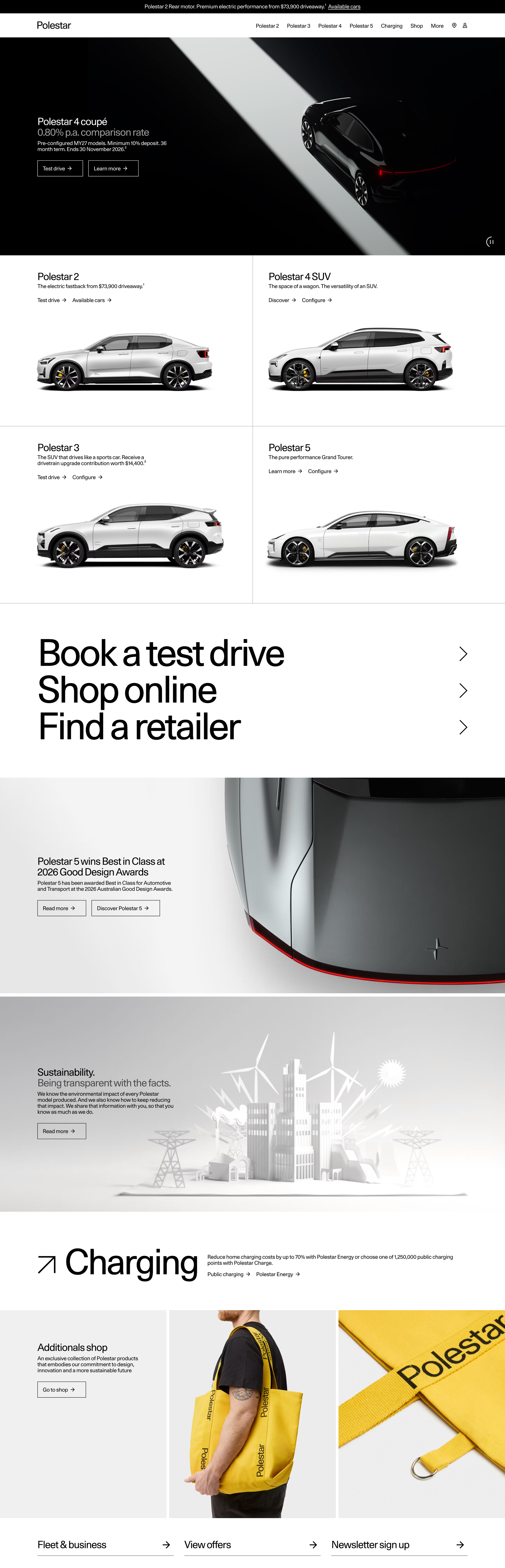
The redesign of the Polestar homepage started with a fundamental shift in its purpose. Previously structured as a collection of campaigns, product highlights and content from across the organisation, the page had become increasingly long and fragmented. The ambition was to move away from a content-heavy destination towards a more intentional entry point, helping visitors discover the brand, explore its cars and move naturally towards their next step.
The new design introduces a more restrained and distinctive visual language, bringing the homepage closer to Polestar's brand identity. A minimalist layout, generous white space and carefully art-directed imagery give the vehicles greater prominence. Inspired in part by fashion and editorial design, the car portfolio is presented through a structured image grid, while oversized typography brings clarity and emphasis to key navigation and conversion opportunities.
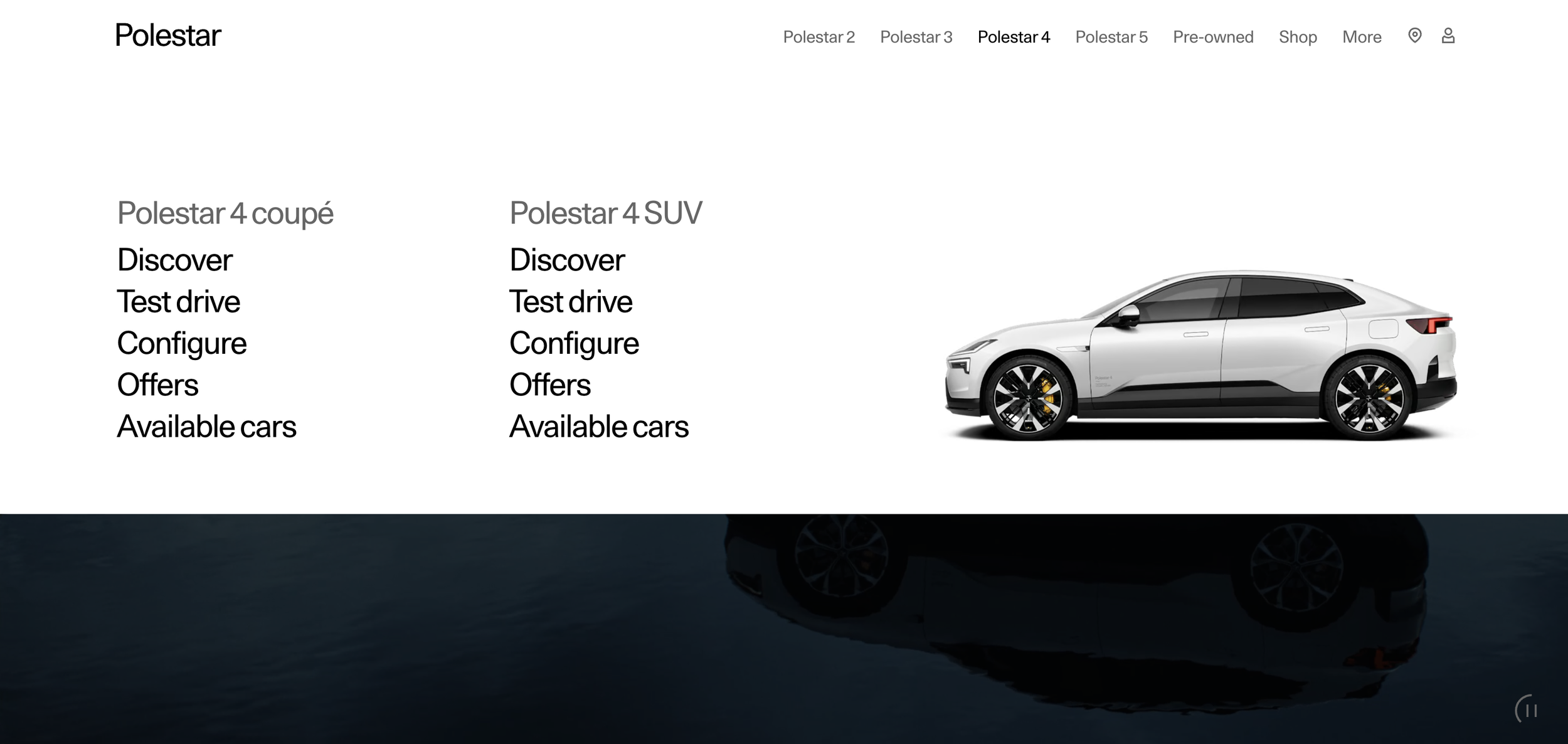
Developed as a separate initiative, the redesigned global navigation follows a similar principle of simplifying the customer journey. With a focused vehicle lineup, the desktop mega menu provides direct access to each model, combining vehicle imagery with links to key destinations, from product discovery and test drives to configuration, offers and available cars. The visual presentation also helps visitors associate model names with the vehicles themselves, particularly valuable for a relatively young automotive brand.
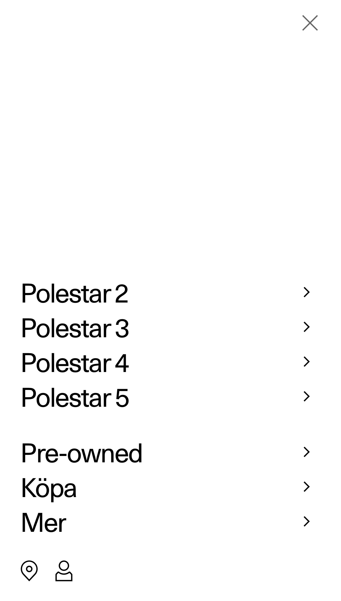
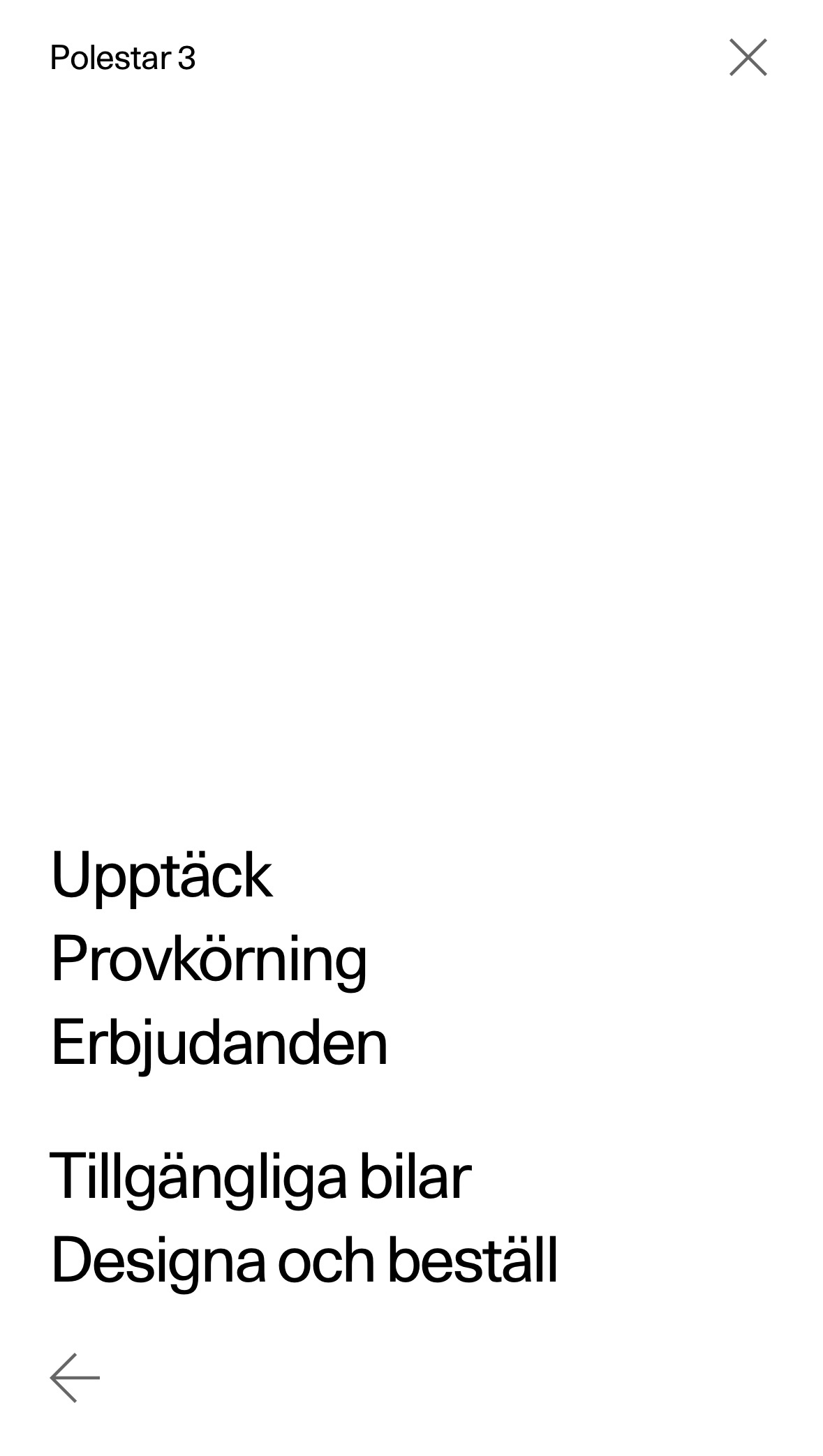
On mobile, the same navigation structure takes on a more minimal, typography-led expression. A full-screen interface, oversized links and generous negative space create a focused experience, while progressive disclosure allows visitors to move from selecting a vehicle to exploring its specific destinations. Rather than replicating the desktop layout, the design adapts to the characteristics of each device while preserving a consistent information hierarchy.
level 1 navigation mobile
level 2 navigation mobile
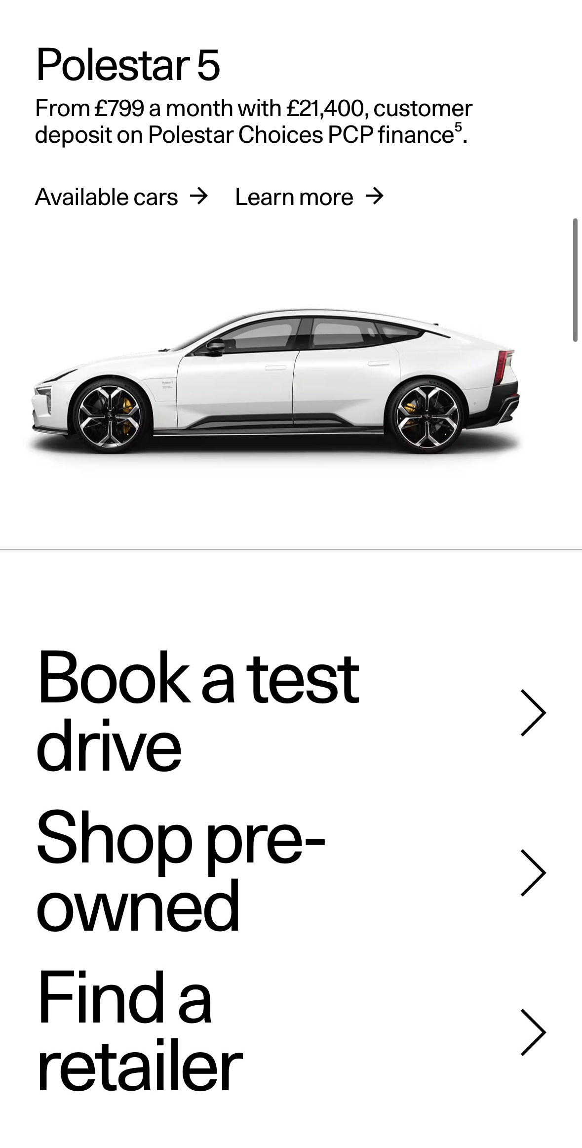

Together, the homepage and mega menu reflect a shared approach to digital product design: reducing complexity without compromising brand expression. Rather than asking visitors to navigate through an extensive collection of content, both experiences establish clearer priorities, allowing the design to guide attention and make the next step more apparent.
Andrea Malanski (Design Direction and Concept)
Ingrid Saori Furuta (UI Design and Production)
Christian Servando (Copywriting)
Elias Helleborn (Lead Development)
Chrisanthi Ikonomidou (Product Ownership)
Digital Product Design & Art Direction · 2025